


React Native Gifted Chat
The most complete chat UI for React Native & Web
[!NOTE] Active development has moved. This package is now in maintenance mode and isn't receiving new features. Development continues - including streaming AI messages and the latest fixes - in a maintained fork: @kesha-antonov/react-native-chat. New projects are encouraged to use it; migrating is mostly a rename (see the fork's migration guide).
✨ Features
- 🎨 Fully Customizable - Override any component with your own implementation
- 📎 Composer Actions - Attach photos, files, or trigger custom actions
- ↩️ Reply to Messages - Swipe-to-reply with reply preview and message threading
- ⏮️ Load Earlier Messages - Infinite scroll with pagination support
- 📋 Copy to Clipboard - Long-press messages to copy text
- 🔗 Smart Link Parsing - Auto-detect URLs, emails, phone numbers, hashtags, mentions
- 👤 Avatars - User initials or custom avatar images
- 🌍 Localized Dates - Full i18n support via Day.js
- ⌨️ Keyboard Handling - Smart keyboard avoidance for all platforms
- 💬 System Messages - Display system notifications in chat
- ⚡ Quick Replies - Bot-style quick reply buttons
- 😀 Emoji Reactions - Long-press to react, with reaction pills and an optional full emoji browser
- ✍️ Typing Indicator - Show when users are typing
- ✅ Message Status - Tick indicators for sent/delivered/read states
- ⬇️ Scroll to Bottom - Quick navigation button
- 🌐 Web Support - Works with react-native-web
- 📱 Expo Support - Easy integration with Expo projects
- 📝 TypeScript - Complete TypeScript definitions included
Sponsors
|
|
|
Le Reacteur - Coding Bootcamp in Paris co-founded by Farid Safi
Stream - Scalable chat API/Server written in Go (API Tour | Tutorial)
Ethora - A complete app engine featuring GiftedChat (GitHub)
📚 React Key Concepts (2nd ed.)
📖 Table of Contents
- Features
- Requirements
- Installation
- Usage
- Props Reference
- Data Structure
- Platform Notes
- Example App
- Troubleshooting
- Contributing
- Authors
- License
📋 Requirements
| Requirement | Version |
|---|---|
| React Native | >= 0.70.0 |
| iOS | >= 13.4 |
| Android | API 21+ (Android 5.0) |
| Expo | SDK 50+ |
| TypeScript | >= 5.0 (optional) |
📦 Installation
Expo Projects
npx expo install react-native-gifted-chat react-native-reanimated react-native-gesture-handler react-native-safe-area-context react-native-keyboard-controller
Bare React Native Projects
Step 1: Install the packages
Using yarn:
yarn add react-native-gifted-chat react-native-reanimated react-native-gesture-handler react-native-safe-area-context react-native-keyboard-controller
Using npm:
npm install --save react-native-gifted-chat react-native-reanimated react-native-gesture-handler react-native-safe-area-context react-native-keyboard-controller
Step 2: Install iOS pods
npx pod-install
Step 3: Configure react-native-reanimated
Follow the react-native-reanimated installation guide to add the Babel plugin.
🚀 Usage
Basic Example
import React, { useState, useCallback, useEffect } from 'react'
import { GiftedChat } from 'react-native-gifted-chat'
import { useHeaderHeight } from '@react-navigation/elements'

export function Example() {
  const [messages, setMessages] = useState([])

  // keyboardVerticalOffset = distance from screen top to GiftedChat container
  // useHeaderHeight() returns status bar + navigation header height
  const headerHeight = useHeaderHeight()

  useEffect(() => {
    setMessages([
      {
        _id: 1,
        text: 'Hello developer',
        createdAt: new Date(),
        user: {
          _id: 2,
          name: 'John Doe',
          avatar: 'https://placeimg.com/140/140/any',
        },
      },
    ])
  }, [])

  const onSend = useCallback((messages = []) => {
    setMessages(previousMessages =>
      GiftedChat.append(previousMessages, messages),
    )
  }, [])

  return (
    <GiftedChat
      messages={messages}
      onSend={messages => onSend(messages)}
      user={{
        _id: 1,
      }}
      keyboardAvoidingViewProps={{ keyboardVerticalOffset: headerHeight }}
    />
  )
}
💡 Tip: Check out more examples in the
exampledirectory including Slack-style messages, quick replies, and custom components.
📊 Data Structure
Messages, system messages, and quick replies follow the structure defined in Models.ts.
Message Object Structure
interface IMessage {
  _id: string | number
  text: string
  createdAt: Date | number
  user: User
  image?: string
  video?: string
  audio?: string
  system?: boolean
  sent?: boolean
  received?: boolean
  pending?: boolean
  quickReplies?: QuickReplies
}

interface User {
  _id: string | number
  name?: string
  avatar?: string | number | (() => React.ReactNode)
}
📖 Props Reference
Core Configuration
messages(Array) - Messages to displayuser(Object) - User sending the messages:{ _id, name, avatar }onSend(Function) - Callback when sending a messagemessageIdGenerator(Function) - Generate an id for new messages. Defaults to a simple random string generator.locale(String) - Locale to localize the dates. You need first to import the locale you need (ie.require('dayjs/locale/de')orimport 'dayjs/locale/fr')colorScheme('light' | 'dark') - Force color scheme (light/dark mode). When set to'light'or'dark', it overrides the system color scheme. Whenundefined, it uses the system color scheme. Default isundefined.
Refs
messagesContainerRef(FlatList ref) - Ref to the flatlisttextInputRef(TextInput ref) - Ref to the text input
Keyboard & Layout
keyboardProviderProps(Object) - Props to be passed to theKeyboardProviderfor keyboard handling. Default values:statusBarTranslucent: true- Required on Android for correct keyboard height calculation when status bar is translucent (edge-to-edge mode)navigationBarTranslucent: true- Required on Android for correct keyboard height calculation when navigation bar is translucent (edge-to-edge mode)
disableKeyboardProvider(Bool) - Skip rendering the built-inKeyboardProviderwrapper; default isfalse. Enable this when your app already mounts its ownKeyboardProvider(e.g. once at the root), or when the default edge-to-edge behavior causes a layout shift, flicker on mount, or a header/content jump on Android/Expo. See Using your ownKeyboardProviderbelow.keyboardAvoidingViewProps(Object) - Props to be passed to theKeyboardAvoidingView. See keyboardVerticalOffset below for proper keyboard handling.isAlignedTop(Boolean) Controls whether or not the message bubbles appear at the top of the chat (Default is false - bubbles align to bottom)isInverted(Bool) - Reverses display order ofmessages; default istrue
Understanding keyboardVerticalOffset
The keyboardVerticalOffset tells the KeyboardAvoidingView where its container starts relative to the top of the screen. This is essential when GiftedChat is not positioned at the very top of the screen (e.g., when you have a navigation header).
Default value: insets.top (status bar height from useSafeAreaInsets()). This works correctly only when GiftedChat fills the entire screen without a navigation header. If you have a navigation header, you need to pass the correct offset via keyboardAvoidingViewProps.
What the value means: The offset equals the distance (in points) from the top of the screen to the top of your GiftedChat container. This typically includes:
- Status bar height
- Navigation header height (on iOS,
useHeaderHeight()already includes status bar)
How to use:
import { useHeaderHeight } from '@react-navigation/elements'

function ChatScreen() {
  // useHeaderHeight() returns status bar + navigation header height on iOS
  const headerHeight = useHeaderHeight()

  return (
    <GiftedChat
      keyboardAvoidingViewProps={{ keyboardVerticalOffset: headerHeight }}
      // ... other props
    />
  )
}
Note:
useHeaderHeight()requires your chat component to be rendered inside a proper navigation screen (not conditional rendering). If it returns0, ensure your chat screen is a real navigation screen with a visible header.
Why this matters: Without the correct offset, the keyboard may overlap the input field or leave extra space. The KeyboardAvoidingView uses this value to calculate how much to shift the content when the keyboard appears.
Using your own KeyboardProvider
By default GiftedChat wraps itself in a KeyboardProvider with statusBarTranslucent and navigationBarTranslucent enabled. On some Android/Expo (edge-to-edge) setups this can cause the screen to shift down, flicker on mount, or distort a navigation header - especially when another KeyboardProvider already exists higher in the tree.
Set disableKeyboardProvider to skip the built-in wrapper:
import { KeyboardProvider } from 'react-native-keyboard-controller'

// Mount a single KeyboardProvider once, near the root of your app
function App() {
  return (
    <KeyboardProvider>
      {/* ...navigation / screens... */}
    </KeyboardProvider>
  )
}

function ChatScreen() {
  return (
    <GiftedChat
      disableKeyboardProvider
      // ... other props
    />
  )
}
Important: GiftedChat's keyboard avoidance relies on a
KeyboardProviderbeing present in the tree. When you setdisableKeyboardProvider, you must mount your ownKeyboardProviderabove GiftedChat - otherwise the keyboard will cover the input. Mounting exactly one provider (yours) is what avoids the double edge-to-edge shift.
Text Input & Composer
text(String) - Input text; default isundefined, but if specified, it will override GiftedChat's internal state. Useful for managing text state outside of GiftedChat (e.g. with Redux). Don't forget to implementtextInputProps.onChangeTextto update the text state.initialText(String) - Initial text to display in the input fieldisSendButtonAlwaysVisible(Bool) - Always show send button in input text composer; defaultfalse, show only when text input is not emptyisTextOptional(Bool) - Allow sending messages without text (useful for media-only messages); defaultfalse. Use withisSendButtonAlwaysVisiblefor media attachments.minComposerHeight(Object) - Custom min-height of the composer.maxComposerHeight(Object) - Custom max height of the composer.minInputToolbarHeight(Integer) - Minimum height of the input toolbar; default is44renderInputToolbar(Component | Function) - Custom message composer containerrenderComposer(Component | Function) - Custom text input message composerrenderSend(Component | Function) - Custom send button; you can pass children to the originalSendcomponent quite easily, for example, to use a custom icon (example)renderActions(Component | Function) - Custom action button on the left of the message composerrenderAccessory(Component | Function) - Custom second line of actions below the message composertextInputProps(Object) - props to be passed to the<TextInput>.
Actions & Action Sheet
onPressActionButton(Function) - Callback when the Action button is pressed (if set, the defaultactionSheetwill not be used)actionSheet(Function) - Custom action sheet interface for showing action optionsactions(Array) - Custom action options for the input toolbar action button; array of objects withtitle(string) andaction(function) propertiesactionSheetOptionTintColor(String) - Tint color for action sheet options
Messages & Message Container
messagesContainerStyle(Object) - Custom style for the messages containerrenderMessage(Component | Function) - Custom message containerrenderLoading(Component | Function) - Render a loading view when initializingrenderChatEmpty(Component | Function) - Custom component to render in the ListView when messages are emptyrenderChatFooter(Component | Function) - Custom component to render below the MessagesContainer (separate from the ListView)listProps(Object) - Extra props to be passed to the messages<FlatList>. Supports all FlatList props includingmaintainVisibleContentPositionfor keeping scroll position when new messages arrive (useful for AI chatbots).
Message Bubbles & Content
renderBubble(Component | Function(props: BubbleProps)) - Custom message bubble. Receives BubbleProps as parameter.renderMessageText(Component | Function) - Custom message textrenderMessageImage(Component | Function) - Custom message imagerenderMessageVideo(Component | Function) - Custom message videorenderMessageAudio(Component | Function) - Custom message audiorenderCustomView(Component | Function) - Custom view inside the bubbleisCustomViewBottom(Bool) - Determine whether renderCustomView is displayed before or after the text, image and video views; default isfalseonPressMessage(Function(context,message)) - Callback when a message bubble is pressedonLongPressMessage(Function(context,message)) - Callback when a message bubble is long-pressed; you can use this to show action sheets (e.g., copy, delete, reply)imageProps(Object) - Extra props to be passed to the<Image>component created by the defaultrenderMessageImageimageStyle(Object) - Custom style for message imagesvideoProps(Object) - Extra props to be passed to the video component created by the requiredrenderMessageVideomessageTextProps(Object) - Extra props to be passed to the MessageText component. Useful for customizing link parsing behavior, text styles, and matchers. Supports the following props:matchers- Custom matchers for linking message content (like URLs, phone numbers, hashtags, mentions)linkStyle- Custom style for linksemail- Enable/disable email parsing (default: true)phone- Enable/disable phone number parsing (default: true)url- Enable/disable URL parsing (default: true)hashtag- Enable/disable hashtag parsing (default: false)mention- Enable/disable mention parsing (default: false)hashtagUrl- Base URL for hashtags (e.g., 'https://x.com/hashtag')mentionUrl- Base URL for mentions (e.g., 'https://x.com')stripPrefix- Strip 'http://' or 'https://' from URL display (default: false)TextComponent- Custom Text component to use (e.g., from react-native-gesture-handler)
Example:
<GiftedChat
  messageTextProps={{
    phone: false, // Disable default phone number linking
    matchers: [
      {
        type: 'phone',
        pattern: /\+?[1-9][0-9\-\(\) ]{7,}[0-9]/g,
        getLinkUrl: (replacerArgs: ReplacerArgs): string => {
          return replacerArgs[0].replace(/[\-\(\) ]/g, '')
        },
        getLinkText: (replacerArgs: ReplacerArgs): string => {
          return replacerArgs[0]
        },
        style: styles.linkStyle,
        onPress: (match: CustomMatch) => {
          const url = match.getAnchorHref()

          const options: {
            title: string
            action?: () => void
          }[] = [
            { title: 'Copy', action: () => setStringAsync(url) },
            { title: 'Call', action: () => Linking.openURL(`tel:${url}`) },
            { title: 'Send SMS', action: () => Linking.openURL(`sms:${url}`) },
            { title: 'Cancel' },
          ]

          showActionSheetWithOptions({
            options: options.map(o => o.title),
            cancelButtonIndex: options.length - 1,
          }, (buttonIndex?: number) => {
            if (buttonIndex === undefined)
              return

            const option = options[buttonIndex]
            option.action?.()
          })
        },
      },
    ],
    linkStyle: { left: { color: 'blue' }, right: { color: 'lightblue' } },
  }}
/>
See full example in LinksExample
Avatars
renderAvatar(Component | Function) - Custom message avatar; set tonullto not render any avatar for the messageisUserAvatarVisible(Bool) - Whether to render an avatar for the current user; default isfalse, only show avatars for other usersisAvatarVisibleForEveryMessage(Bool) - When false, avatars will only be displayed when a consecutive message is from the same user on the same day; default isfalseonPressAvatar(Function(user)) - Callback when a message avatar is tappedonLongPressAvatar(Function(user)) - Callback when a message avatar is long-pressedisAvatarOnTop(Bool) - Render the message avatar at the top of consecutive messages, rather than the bottom; default isfalse
Username
isUsernameVisible(Bool) - Indicate whether to show the user's username inside the message bubble; default isfalserenderUsername(Component | Function) - Custom Username container
Date & Time
timeFormat(String) - Format to use for rendering times; default is'LT'(see Day.js Format)dateFormat(String) - Format to use for rendering dates; default is'D MMMM'(see Day.js Format)dateFormatCalendar(Object) - Format to use for rendering relative times; default is{ sameDay: '[Today]' }(see Day.js Calendar)renderDay(Component | Function) - Custom day above a message. The same function renders both the inline day separators and the floating/animated day header that sticks to the top while scrolling. Readprops.isAnimated(truefor the floating header,falsefor the inline separator) to give each a different look.dayProps(Object) - Props to pass to the Day component:containerStyle- Custom style for the day containerwrapperStyle- Custom style for the day wrappertextProps- Props to pass to the Text component (e.g.,style,allowFontScaling,numberOfLines)
renderTime(Component | Function) - Custom time inside a messagetimeTextStyle(Object) - Custom text style for time inside messages (supports left/right styles)isDayAnimationEnabled(Bool) - Enable animated day label that appears on scroll; default istrue
System Messages
renderSystemMessage(Component | Function) - Custom system message
Load Earlier Messages
loadEarlierMessagesProps(Object) - Props to pass to the LoadEarlierMessages component. The button is only visible whenisAvailableistrue. Supports the following props:isAvailable- Controls button visibility (default: false)onPress- Callback when button is pressedisLoading- Display loading indicator (default: false)isInfiniteScrollEnabled- Enable infinite scroll up when reaching the top of messages container, automatically callsonPress(not yet supported for web)label- Override the default "Load earlier messages" textcontainerStyle- Custom style for the button containerwrapperStyle- Custom style for the button wrappertextStyle- Custom style for the button textactivityIndicatorStyle- Custom style for the loading indicatoractivityIndicatorColor- Color of the loading indicator (default: 'white')activityIndicatorSize- Size of the loading indicator (default: 'small')
renderLoadEarlier(Component | Function) - Custom "Load earlier messages" button
Typing Indicator
isTyping(Bool) - Typing Indicator state; defaultfalse. If you userenderFooterit will override this.renderTypingIndicator(Component | Function) - Custom typing indicator componenttypingIndicatorStyle(StyleProp) - Custom style for the TypingIndicator component.renderFooter(Component | Function) - Custom footer component on the ListView, e.g.'User is typing...'; see CustomizedFeaturesExample.tsx for an example. Overrides default typing indicator that triggers whenisTypingis true.
Quick Replies
See Quick Replies example in messages.ts
onQuickReply(Function) - Callback when sending a quick reply (to backend server)renderQuickReplies(Function) - Custom all quick reply viewquickReplyStyle(StyleProp) - Custom quick reply view stylequickReplyTextStyle(StyleProp) - Custom text style for quick reply buttonsquickReplyContainerStyle(StyleProp) - Custom container style for quick repliesrenderQuickReplySend(Function) - Custom quick reply send view
Reply to Messages
Gifted Chat supports swipe-to-reply functionality out of the box. When enabled, users can swipe on a message to reply to it, displaying a reply preview in the input toolbar and the replied message above the new message bubble.
Note: This feature uses
ReanimatedSwipeablefromreact-native-gesture-handlerandreact-native-reanimatedfor smooth, performant animations.
Basic Usage
<GiftedChat
  messages={messages}
  onSend={onSend}
  user={{ _id: 1 }}
  reply={{
    swipe: {
      isEnabled: true,
      direction: 'left', // swipe left to reply
    },
  }}
/>
Reply Props (Grouped)
The reply prop accepts an object with the following structure:
interface ReplyProps<TMessage> {
  // Swipe gesture configuration
  swipe?: {
    isEnabled?: boolean              // Enable swipe-to-reply; default false
    direction?: 'left' | 'right'     // Swipe direction; default 'left'
    onSwipe?: (message: TMessage) => void  // Callback when swiped
    renderAction?: (                 // Custom swipe action component
      progress: SharedValue<number>,
      translation: SharedValue<number>,
      position: 'left' | 'right'
    ) => React.ReactNode
    actionContainerStyle?: StyleProp<ViewStyle>
  }

  // Reply preview styling (above input toolbar)
  previewStyle?: {
    containerStyle?: StyleProp<ViewStyle>
    textStyle?: StyleProp<TextStyle>
    imageStyle?: StyleProp<ImageStyle>
  }

  // In-bubble reply styling
  messageStyle?: {
    containerStyle?: StyleProp<ViewStyle>
    containerStyleLeft?: StyleProp<ViewStyle>
    containerStyleRight?: StyleProp<ViewStyle>
    textStyle?: StyleProp<TextStyle>
    textStyleLeft?: StyleProp<TextStyle>
    textStyleRight?: StyleProp<TextStyle>
    imageStyle?: StyleProp<ImageStyle>
  }

  // Callbacks and state
  message?: ReplyMessage             // Controlled reply state
  onClear?: () => void               // Called when reply cleared
  onPress?: (message: TMessage) => void  // Called when reply preview tapped

  // Custom renderers
  renderPreview?: (props: ReplyPreviewProps) => React.ReactNode
  renderMessageReply?: (props: MessageReplyProps) => React.ReactNode
}
ReplyMessage Structure
When a message has a reply, it includes a replyMessage property:
interface ReplyMessage {
  _id: string | number
  text: string
  user: User
  image?: string
  audio?: string
}
Advanced Example with External State
const [replyMessage, setReplyMessage] = useState<ReplyMessage | null>(null)

<GiftedChat
  messages={messages}
  onSend={messages => {
    const newMessages = messages.map(msg => ({
      ...msg,
      replyMessage: replyMessage || undefined,
    }))
    setMessages(prev => GiftedChat.append(prev, newMessages))
    setReplyMessage(null)
  }}
  user={{ _id: 1 }}
  reply={{
    swipe: {
      isEnabled: true,
      direction: 'right',
      onSwipe: setReplyMessage,
    },
    message: replyMessage,
    onClear: () => setReplyMessage(null),
    onPress: (msg) => scrollToMessage(msg._id),
  }}
/>
Smooth Animations
The reply preview automatically animates when:
- Appearing: Smoothly expands from zero height with fade-in effect
- Disappearing: Smoothly collapses with fade-out effect
- Content changes: Smoothly transitions when replying to a different message
These animations use react-native-reanimated for 60fps performance.
Scroll to Bottom
isScrollToBottomEnabled(Bool) - Enables the scroll to bottom Component (Default is false)scrollToBottomComponent(Function) - Custom Scroll To Bottom Component containerscrollToBottomOffset(Integer) - Custom Height Offset upon which to begin showing Scroll To Bottom Component (Default is 200)scrollToBottomStyle(Object) - Custom style for Scroll To Bottom wrapper (position, bottom, right, etc.)scrollToBottomContentStyle(Object) - Custom style for Scroll To Bottom content (size, background, shadow, etc.)
Maintaining Scroll Position (AI Chatbots)
For AI chat interfaces where long responses arrive and you don't want to disrupt the user's reading position, use maintainVisibleContentPosition via listProps:
// Basic usage - always maintain scroll position
<GiftedChat
  listProps={{
    maintainVisibleContentPosition: {
      minIndexForVisible: 0,
    },
  }}
/>

// With auto-scroll threshold - auto-scroll if within 10 pixels of newest content
<GiftedChat
  listProps={{
    maintainVisibleContentPosition: {
      minIndexForVisible: 0,
      autoscrollToTopThreshold: 10,
    },
  }}
/>

// Conditionally enable based on scroll state (recommended for chatbots)
const [isScrolledUp, setIsScrolledUp] = useState(false)

<GiftedChat
  listProps={{
    onScroll: (event) => {
      setIsScrolledUp(event.contentOffset.y > 50)
    },
    maintainVisibleContentPosition: isScrolledUp
      ? { minIndexForVisible: 0, autoscrollToTopThreshold: 10 }
      : undefined,
  }}
/>
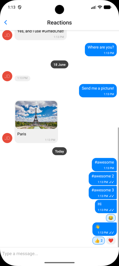
Emoji Reactions
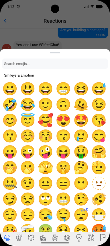
Long-press a message to open a quick emoji picker; selected reactions render as pills below the bubble and toggle on tap. The core ships a lightweight quick picker (built on react-native-gesture-handler and react-native-reanimated, no extra dependencies). A full emoji browser is optional and demonstrated in the example app via the renderReactionPicker override.
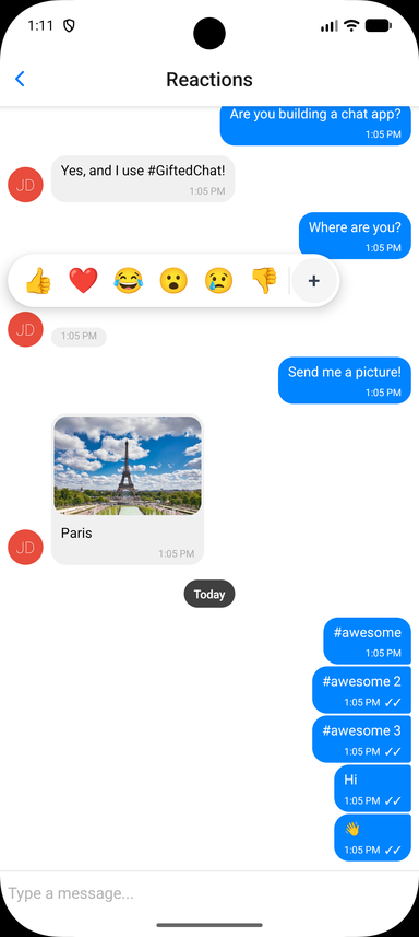
Store reactions on each message as a reactions array, then enable the feature and handle the toggle. Reaction state is owned by you, so it works with any backend:
interface IChatMessage extends IMessage {
  reactions?: MessageReaction[] // { emoji: string, userIds: (string | number)[] }[]
}

const CURRENT_USER_ID = 1

const handleReactionPress = useCallback((message: IChatMessage, emoji: string) => {
  setMessages(prev =>
    prev.map(m => {
      if (m._id !== message._id)
        return m

      const existing = (m.reactions ?? []).find(r => r.emoji === emoji)
      if (!existing)
        return { ...m, reactions: [...(m.reactions ?? []), { emoji, userIds: [CURRENT_USER_ID] }] }

      const userIds = existing.userIds.includes(CURRENT_USER_ID)
        ? existing.userIds.filter(id => id !== CURRENT_USER_ID)
        : [...existing.userIds, CURRENT_USER_ID]

      return {
        ...m,
        reactions: userIds.length === 0
          ? (m.reactions ?? []).filter(r => r.emoji !== emoji)
          : (m.reactions ?? []).map(r => (r.emoji === emoji ? { ...r, userIds } : r)),
      }
    })
  )
}, [])

<GiftedChat
  messages={messages}
  onSend={onSend}
  user={{ _id: CURRENT_USER_ID }}
  reactions={{
    isEnabled: true,
    onReactionPress: handleReactionPress,
    // Optional: provide a richer picker (e.g. a full emoji browser).
    // See example/components/chat-examples/ReactionsExample.tsx
    // renderReactionPicker: props => <MyEmojiPicker {...props} />,
  }}
/>
Reactions Props (Grouped)
The reactions prop accepts:
isEnabled(Bool) - Enable emoji reactions (defaultfalse)emojis(String[]) - Emojis shown in the quick picker (default['👍', '❤️', '😂', '😮', '😢', '👎'])onReactionPress(Function) -(message, emoji) => voidcalled when an emoji is selected or a pill is tapped. Toggle logic is left to yourenderReactions(Function) - Override the reactions-display component rendered below the bubblerenderReactionPicker(Function) - Override the picker shown on long-press (use for a full emoji browser)containerStyle,reactionStyle,reactionActiveStyle,reactionTextStyle,reactionCountStyle- Styles for the reaction pillspickerContainerStyle,pickerEmojiStyle- Styles for the quick picker
Smart Link Parsing
Message text is automatically scanned for URLs, emails, and phone numbers; hashtags and mentions are opt-in. Configure it via messageTextProps:
<GiftedChat
  messageTextProps={{
    url: true,        // default true
    email: true,      // default true
    phone: true,      // default true
    hashtag: true,    // default false
    mention: true,    // default false
    hashtagUrl: 'https://example.com/hashtag',
    mentionUrl: 'https://example.com',
    linkStyle: { left: { color: '#1d9bf0' }, right: { color: '#fff' } },
    onPress: (message, url, type) => {
      // type: 'url' | 'email' | 'phone' | 'mention' | 'hashtag'
      Linking.openURL(url)
    },
  }}
/>
For full control, pass custom matchers ({ type, pattern, getLinkUrl?, getLinkText?, renderLink?, onPress? }[]) to add or override patterns. See the Links example in the example app.
Copy to Clipboard
Long-press handling is exposed via onLongPressMessage. GiftedChat wraps @expo/react-native-action-sheet, so you can show a "Copy Text" action sheet and copy with the clipboard library of your choice:
import { useActionSheet } from '@expo/react-native-action-sheet'
import { setStringAsync } from 'expo-clipboard'

const { showActionSheetWithOptions } = useActionSheet()

<GiftedChat
  onLongPressMessage={(_context, message) => {
    showActionSheetWithOptions(
      { options: ['Copy Text', 'Cancel'], cancelButtonIndex: 1 },
      buttonIndex => {
        if (buttonIndex === 0)
          setStringAsync(message.text)
      }
    )
  }}
/>
Message Status
Set sent, received, or pending on a message to show its delivery status. By default these render as tick indicators next to the timestamp (✓ sent, ✓✓ received, 🕓 pending):
const message: IMessage = {
  _id: 1,
  text: 'Delivered!',
  createdAt: new Date(),
  user: { _id: 1 },
  sent: true,
  received: true,
}
Customize the indicators with renderTicks (full override) or tickStyle (style only):
<GiftedChat
  renderTicks={message => (message.received ? <MyReadIcon /> : null)}
  tickStyle={{ color: '#1d9bf0' }}
/>
TypeScript
GiftedChat ships complete type definitions and is generic over your message type. Extend IMessage to add custom fields and everything stays typed end to end:
import { GiftedChat, IMessage } from 'react-native-gifted-chat'

interface MyMessage extends IMessage {
  reactions?: { emoji: string, userIds: (string | number)[] }[]
}

<GiftedChat<MyMessage>
  messages={messages}
  onSend={msgs => {/* msgs is typed as MyMessage[] */}}
  user={{ _id: 1 }}
/>
📱 Platform Notes
Android
Keyboard configuration
If you are using Create React Native App / Expo, no Android specific installation steps are required. Otherwise, we recommend modifying your project configuration:
Make sure you have android:windowSoftInputMode="adjustResize" in your AndroidManifest.xml:
<activity
  android:name=".MainActivity"
  android:label="@string/app_name"
  android:windowSoftInputMode="adjustResize"
  android:configChanges="keyboard|keyboardHidden|orientation|screenSize">
For Expo, you can append KeyboardAvoidingView after GiftedChat (Android only):
<View style={{ flex: 1 }}>
   <GiftedChat />
   {Platform.OS === 'android' && <KeyboardAvoidingView behavior="padding" />}
</View>
Web (react-native-web)
With create-react-app
- Install react-app-rewired:
yarn add -D react-app-rewired - Create
config-overrides.js:
module.exports = function override(config, env) {
  config.module.rules.push({
    test: /\.js$/,
    exclude: /node_modules[/\\](?!react-native-gifted-chat)/,
    use: {
      loader: 'babel-loader',
      options: {
        babelrc: false,
        configFile: false,
        presets: [
          ['@babel/preset-env', { useBuiltIns: 'usage' }],
          '@babel/preset-react',
        ],
        plugins: ['@babel/plugin-proposal-class-properties'],
      },
    },
  })
  return config
}
Examples:
🧪 Testing
Triggering layout events in tests
TEST_ID is exported as constants that can be used in your testing library of choice.
Gifted Chat uses onLayout to determine the height of the chat container. To trigger onLayout during your tests:
const WIDTH = 200
const HEIGHT = 2000

const loadingWrapper = getByTestId(TEST_ID.LOADING_WRAPPER)
fireEvent(loadingWrapper, 'layout', {
  nativeEvent: {
    layout: {
      width: WIDTH,
      height: HEIGHT,
    },
  },
})
📦 Example App
The repository includes a comprehensive example app demonstrating all features:
# Clone and install
git clone https://github.com/FaridSafi/react-native-gifted-chat.git
cd react-native-gifted-chat/example
yarn install

# Run on iOS
npx expo run:ios

# Run on Android
npx expo run:android

# Run on Web
npx expo start --web
The example app showcases:
- 💬 Basic chat functionality
- 🎨 Custom message bubbles and avatars
- ↩️ Reply to messages with swipe gesture
- ⚡ Quick replies (bot-style)
- ✍️ Typing indicators
- 📎 Attachment actions
- 🔗 Link parsing and custom matchers
- 🌐 Web compatibility
❓ Troubleshooting
TextInput is hidden on Android
Make sure you have android:windowSoftInputMode="adjustResize" in your AndroidManifest.xml. See Android configuration above.
How to set Bubble color for each user?
See this issue for examples.
How to customize InputToolbar styles?
See this issue for examples.
How to manually dismiss the keyboard?
See this issue for examples.
How to use renderLoading?
See this issue for examples.
🤔 Have a Question?
- Check this README first
- Search existing issues
- Ask on StackOverflow
- Open a new issue if needed
🤝 Contributing
Contributions are welcome! Please feel free to submit a Pull Request.
- Fork the repository
- Create your feature branch (
git checkout -b feature/amazing-feature) - Install dependencies (
yarn install) - Make your changes
- Run tests (
yarn test) - Run linting (
yarn lint) - Build the library (
yarn build) - Commit your changes (
git commit -m 'Add amazing feature') - Push to the branch (
git push origin feature/amazing-feature) - Open a Pull Request
Development Setup
# Install dependencies
yarn install

# Build the library
yarn build

# Run tests
yarn test

# Run linting
yarn lint

# Full validation
yarn prepublishOnly
👥 Authors
Original Author: Farid Safi
Co-author: Xavier Carpentier - Hire Xavier
Maintainer: Kesha Antonov
I've been maintaining this project for 2 years, completely in my free time and without any compensation. If you find it helpful, please consider becoming a sponsor to support continued development. 💖
📄 License
Built with ❤️ by the React Native community